
From messaging feature to communications workspace
I helped evolve Square Messages from a lightweight chat panel into a dedicated Inbox, creating a more flexible foundation for sellers to manage customer conversations across Square.
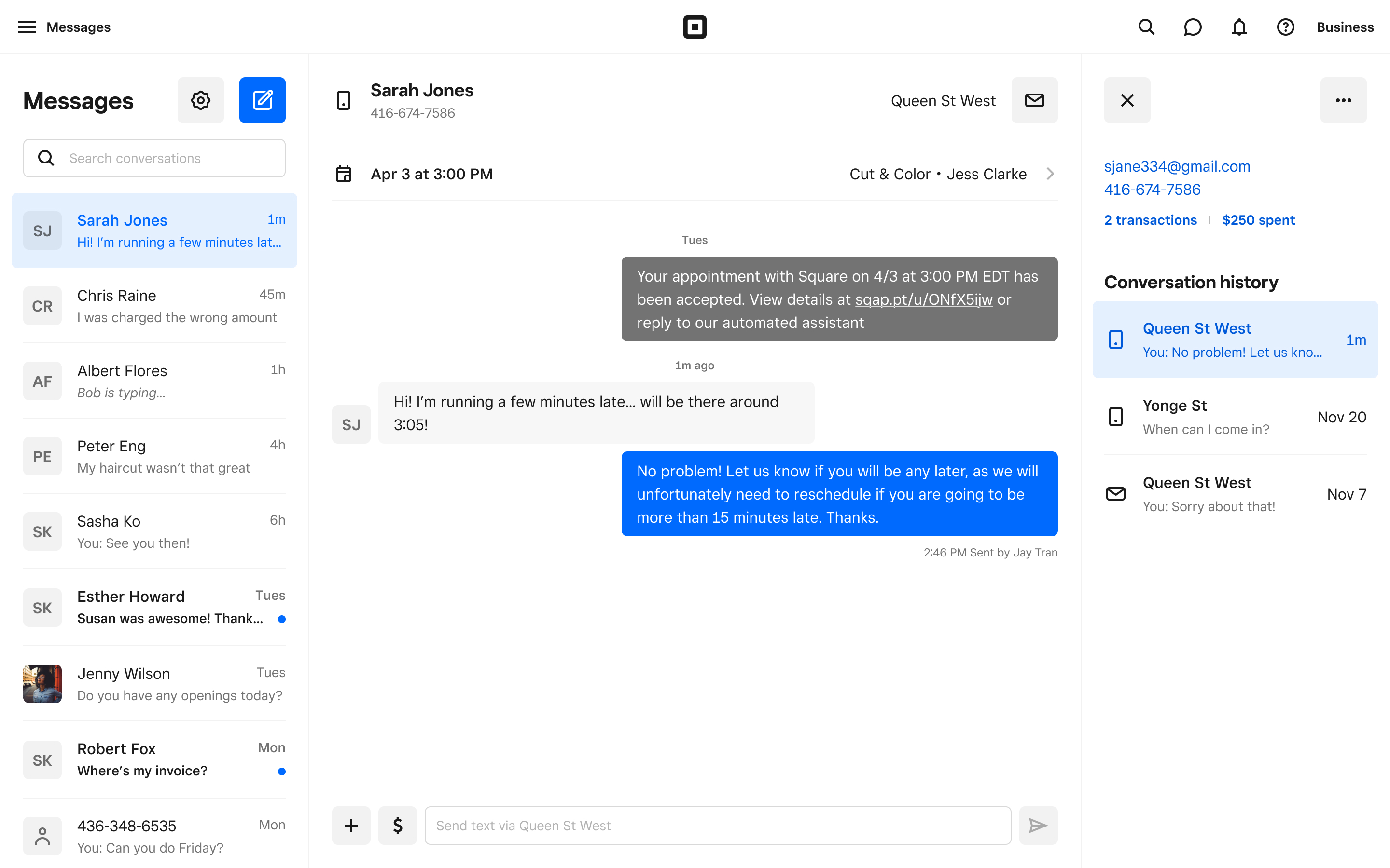
The full-screen Messages Inbox: A dedicated workspace for managing customer conversations, with room for richer customer context and more advanced messaging workflows.
My role
I initially joined as the sole designer, working across research, product planning and interface design as the product grew from a small beta to more than 200,000 monthly active sellers.
I worked across Square’s ecosystem to define how messaging should work, established a research-driven design process for the team, and used both qualitative research and product data to guide decisions, including learning SQL to query message data directly in Snowflake, which helped surface patterns (ie SPAM) that other research alone wouldn’t have caught.
The challenge: A messaging feature that had outgrown its original design
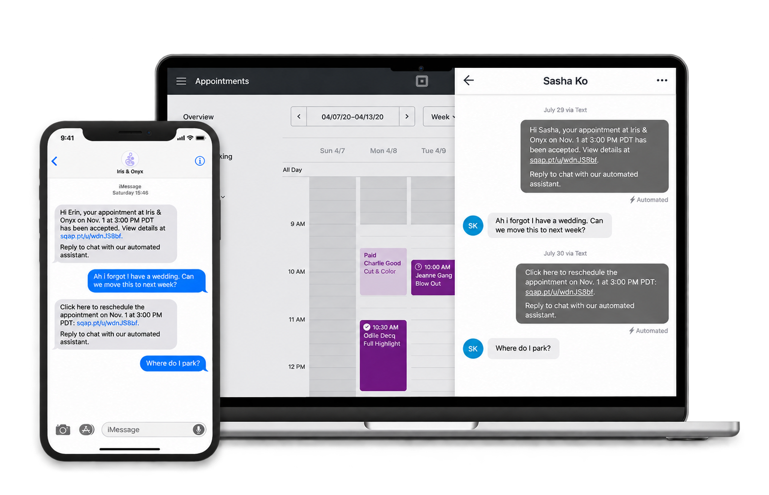
Where Messages started: Messages originally lived in a narrow panel within Square Dashboard, designed for basic conversations that Square Assistant (an AI chatbot that helped reschedule and cancel appointments) couldn't handle.
As the team explored richer customer context, additional channels and more advanced messaging workflows, the existing layout became increasingly limiting.
We needed a structure that could support those possibilities without having every future requirement defined upfront.
Learning from early sellers
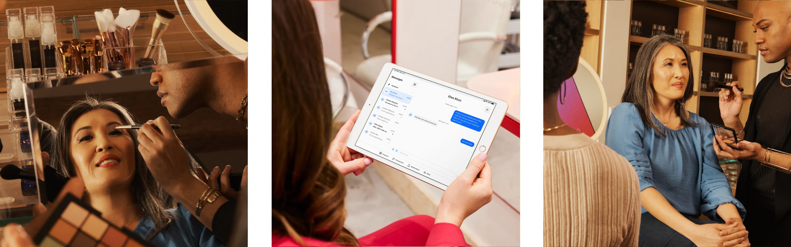
During the closed beta, I partnered with our PM to interview more than 20 sellers and reviewed actual conversations to understand how Messages was being used.
The research reinforced several opportunities we’d been considering: bringing customer communication together, supporting business texting, and making relevant customer information more accessible.
These findings helped us refine the broader product direction as we planned how Messages could evolve beyond its original appointment-focused use case.
Choosing a dedicated Inbox over extending the blade
We considered extending the existing blade, but its limited space was already making it difficult to manage conversations and introduce richer customer information.
I advocated for a dedicated full-screen Inbox because we envisioned Messages becoming a workspace sellers could keep open throughout the day, rather than something they occasionally accessed within Dashboard.
We built on an existing split-panel interaction pattern from the tablet apps to keep conversation management familiar, while establishing room for more advanced functionality.
We also migrated to Square’s Market Design System alongside the redesign. Although this required more upfront work, it avoided rebuilding the same interface again later and gave us a consistent foundation to extend.
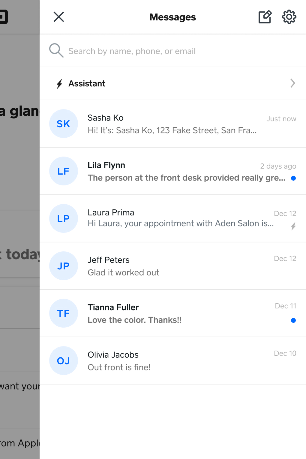
Original blade: Suited to lightweight conversations, but constrained.
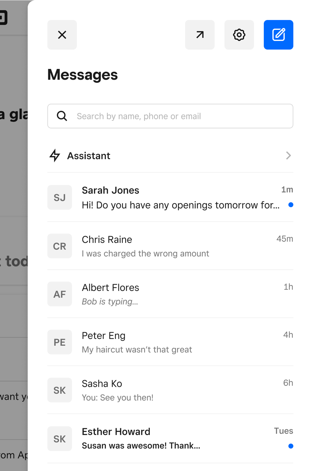
Market Design System exploration: Highlighted the limits of the existing layout.
Full-screen Inbox: Established a workspace with room to evolve.
Bringing context into the conversation
Rather than fitting more information into the conversation itself, I introduced a separate context panel so sellers could reference customer information without interrupting the message thread.
I deliberately started with information already available to us rather than trying to define every future integration upfront. This allowed us to establish the interaction pattern while leaving room to expand based on seller needs.
On mobile, there wasn’t room to show conversations and customer context simultaneously. I surfaced a small amount of relevant information within the conversation and provided entry points to more details, preserving access without overwhelming the screen.
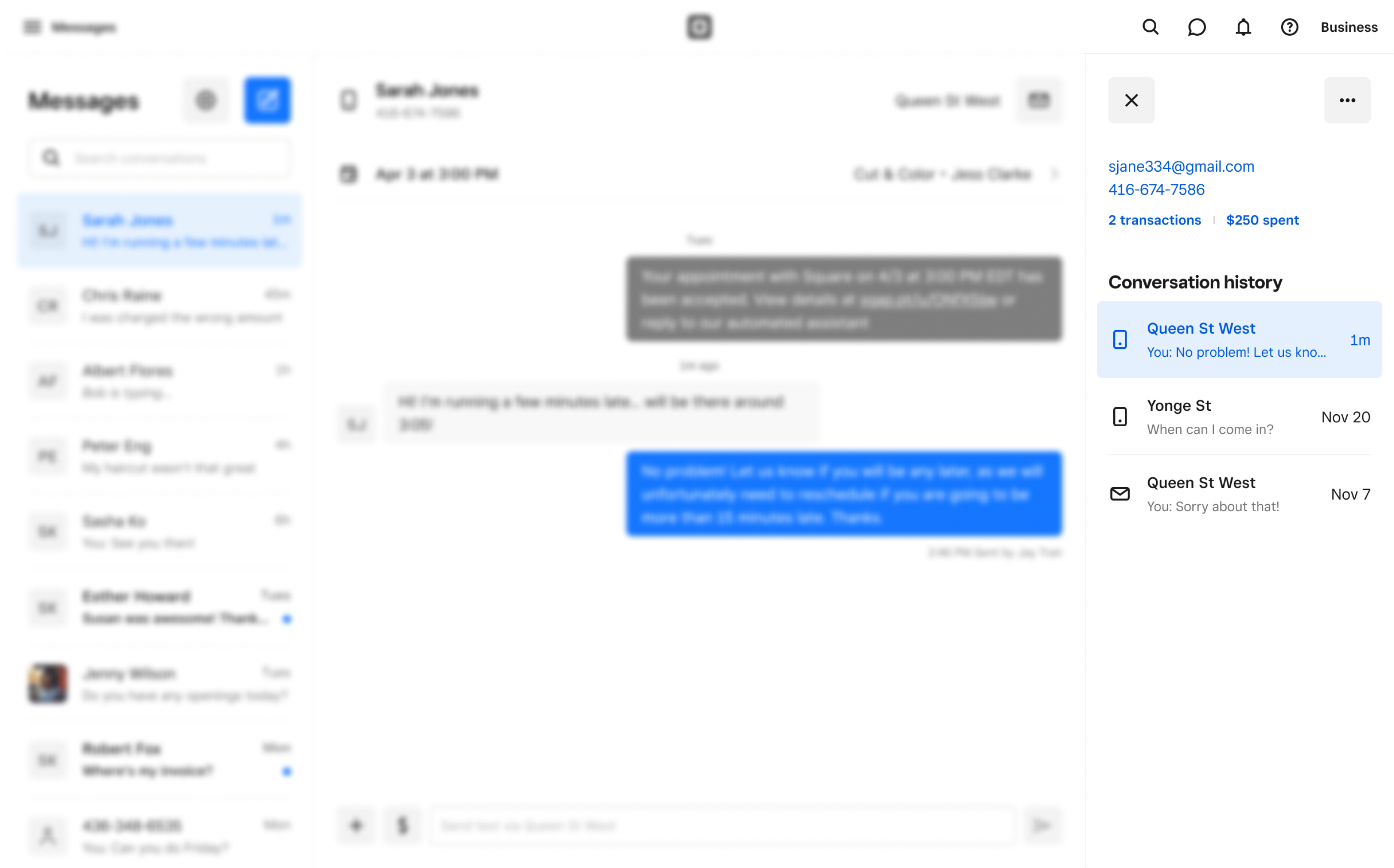
Customer context alongside conversations: Introduced a third column in the desktop Inbox so sellers could reference customer details and history without leaving the conversation.
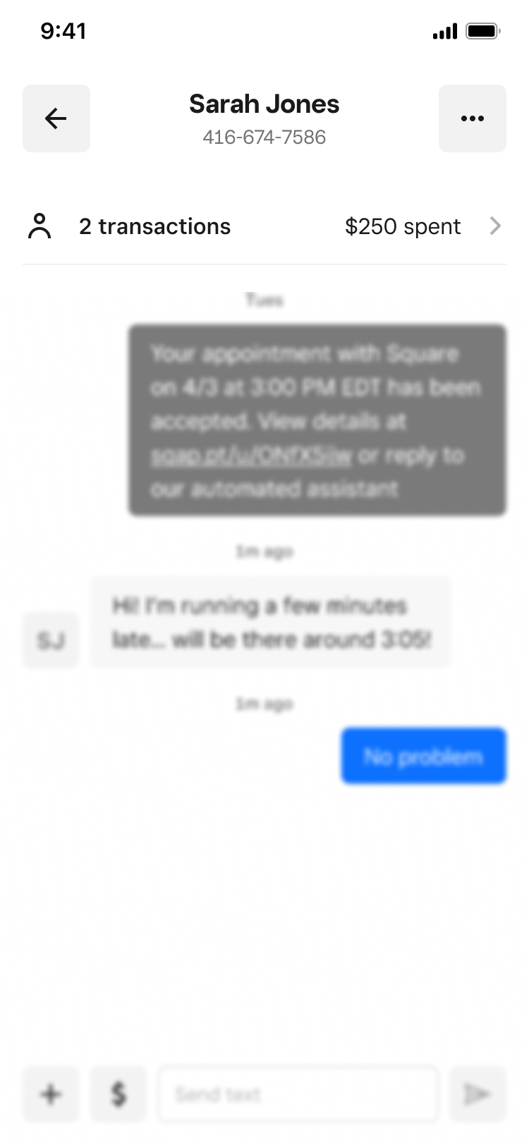
Surfacing key context on mobile: With less screen space, I brought key customer information into the conversation header, giving sellers a quick overview and entry points to more details.
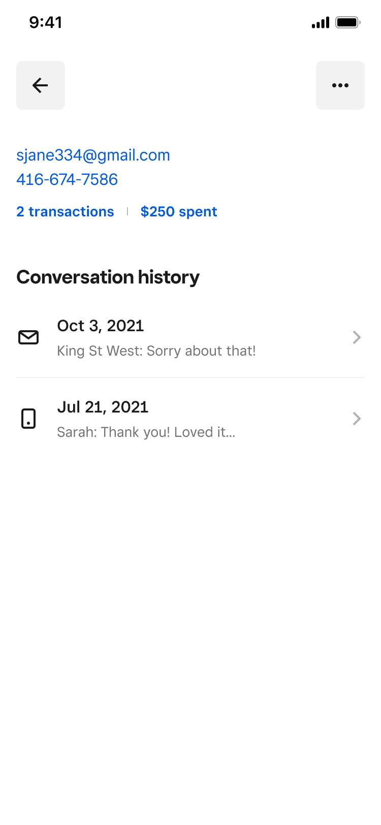
Making the full customer context accessible: Designed a dedicated mobile view for the same information shown in the desktop context panel, keeping the experience consistent without compromising conversation space.
Additional highlights
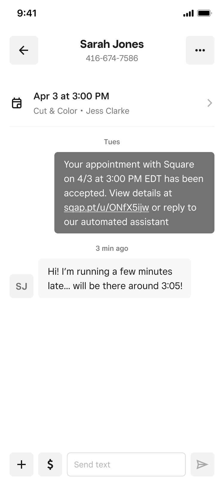
Cross-product collaboration: Working with other Square teams to surface customer and appointment information.
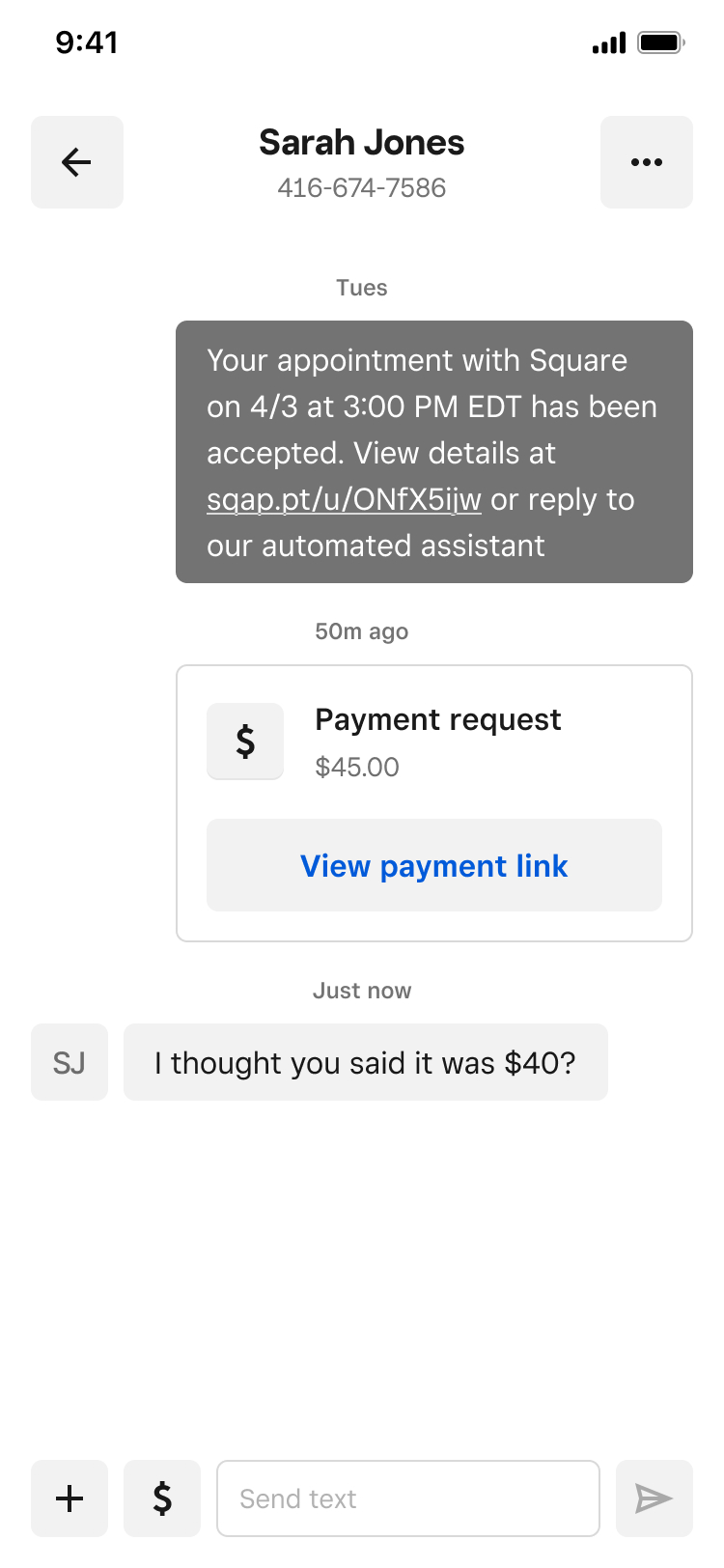
Flexible interface patterns: Supporting different content types within conversations.
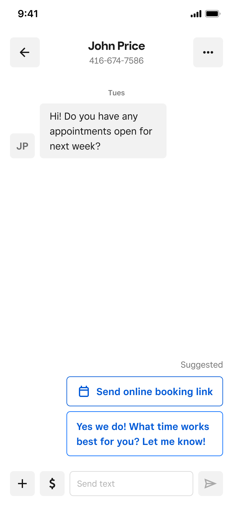
Research-driven product decisions: Testing when AI assistance added value and when sellers wanted control.
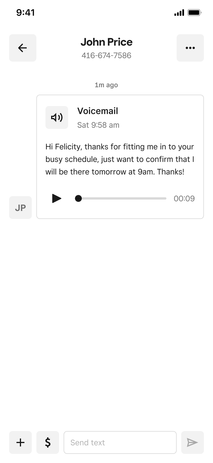
Component design: Adapting shared patterns for novel content such as voicemail.
Outcome & reflection
Building a foundation for continued growth
The full-screen Inbox became the primary destination for Messages, providing a more flexible foundation as the product expanded into paid outbound messaging, deeper Square integrations, and additional communication channels.
Looking back, one of the most valuable parts of this work was figuring out how to make foundational design decisions while the longer-term product requirements were still evolving. It reinforced the importance of building for what we knew sellers needed, while leaving room for the experience to grow.