Making 3D content more accessible
What YouTube did for videos, Verold aimed to do for 3D. The same issues that video creators faced 10 years ago—the passing back and forth of huge files and expensive software and production equipment—has left 3D creators sharing renders as 2D images or video, losing the inherent interactivity of the original file.

Overview
Verold Studio was* a browser-based 3D editor that used WebGL to create interactive presentations on the web. With a complex subject like 3D, Verold’s marketing site needed to clearly communicate what Verold Studio could do, and more importantly, what value it could bring to 3D content creators.
* Verold was acquired by Box in 2015 and is now integrated into Box's web app.
Goals
This redesign project began as an incremental change to a couple of background features that required a lot of attention: documentation, tutorials, and support. As we experimented with new designs for our nearly non-existent documentation section, we began to form hypotheses that this new design could facilitate clearer communication sitewide. Our goals were to increase the number of sign-ups and projects created.
My Role
For this project, I led the UX/UI design of everything that surrounds the Verold Studio editor: marketing pages, documentation, user profiles, project pages, and account settings. I worked closely with our CEO, front end developer and 3D graphics engineers to make sure we were accurately communicating the complex capabilities of Verold in a digestible way.
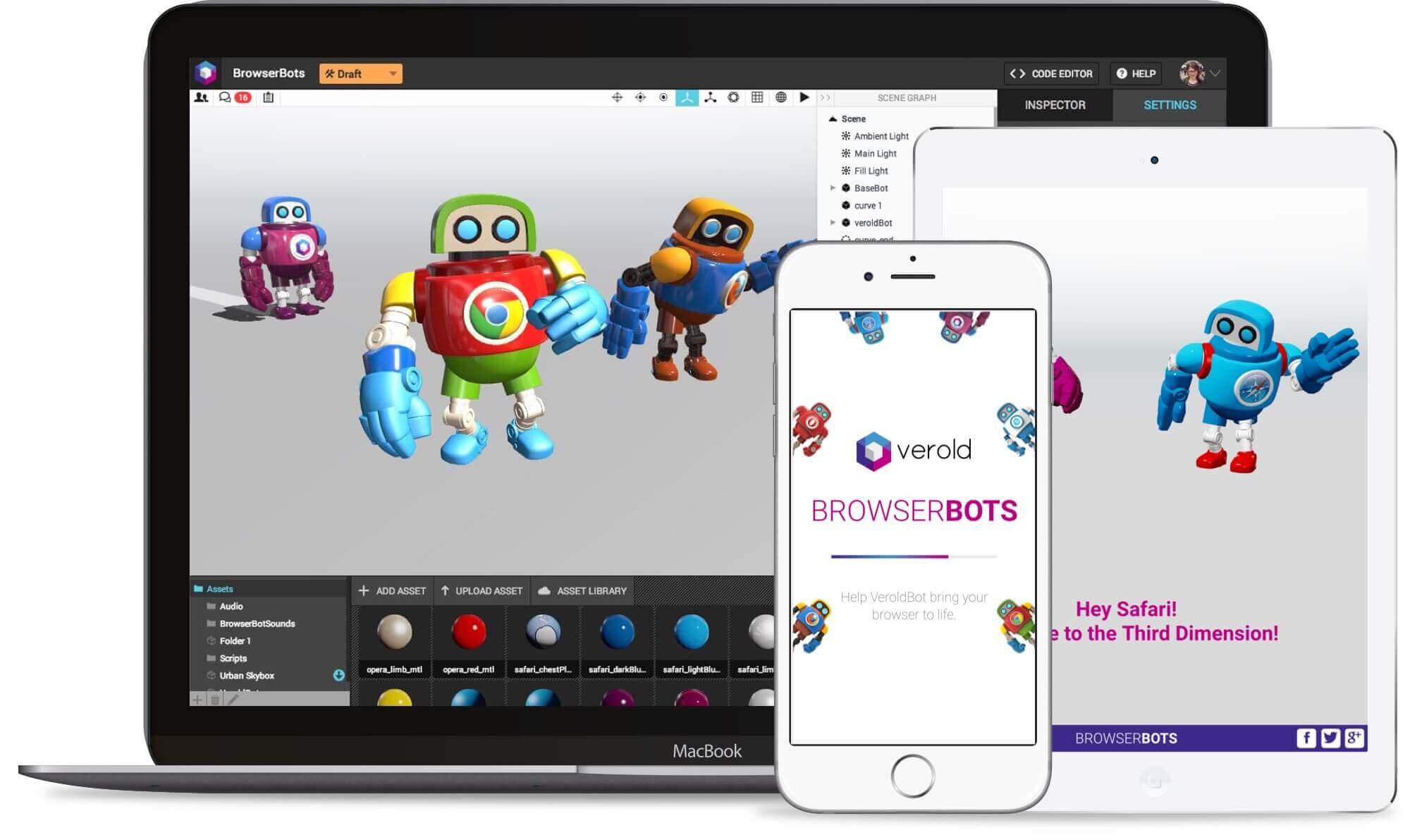
Verold Studio with a model imported, and an example of how the project was embedded within an external site.
Research
To determine whether redesigning the site was a worthwhile endeavour, we conducted usability studies of the existing site, testing three aspects:
- Marketing site content: Participants were asked to visit the existing site and talk about what they thought the site was, who it was for, what one could do there and so forth.
- Project discovery: Participants were asked to look for and explore existing 3D projects.
- Sign-up flow: Participants were asked to sign up for an account and create a new project.
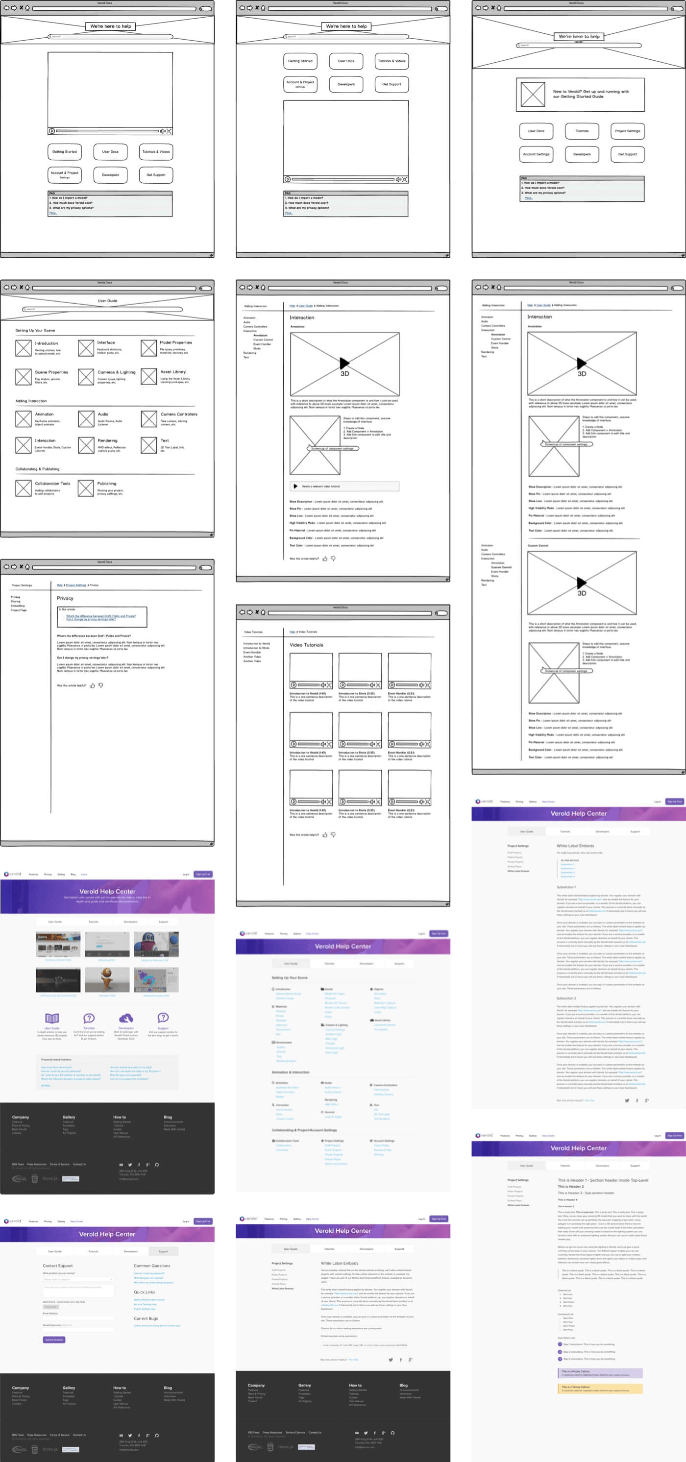
Wireframes & early mocks for the Help & Documentation pages
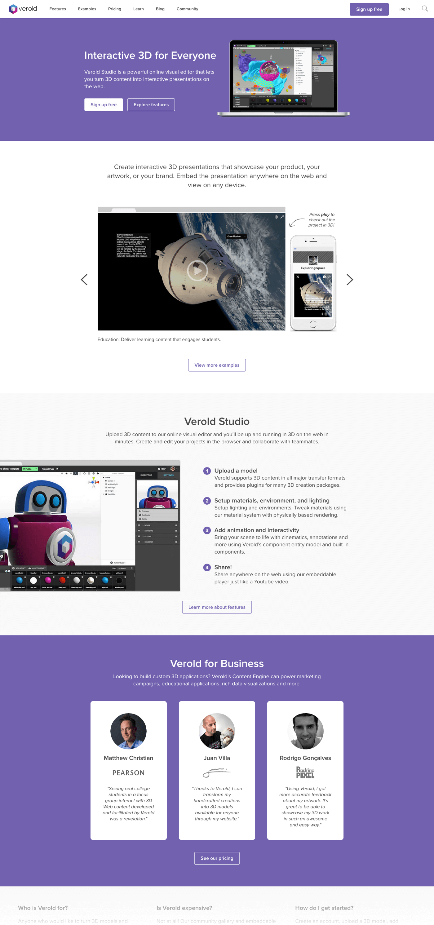
Based on our research, we redesigned the homepage with clear use cases, a simple step-by-step overview of Verold Studio and used the power of faces to show the value of Verold to the personas we identified.
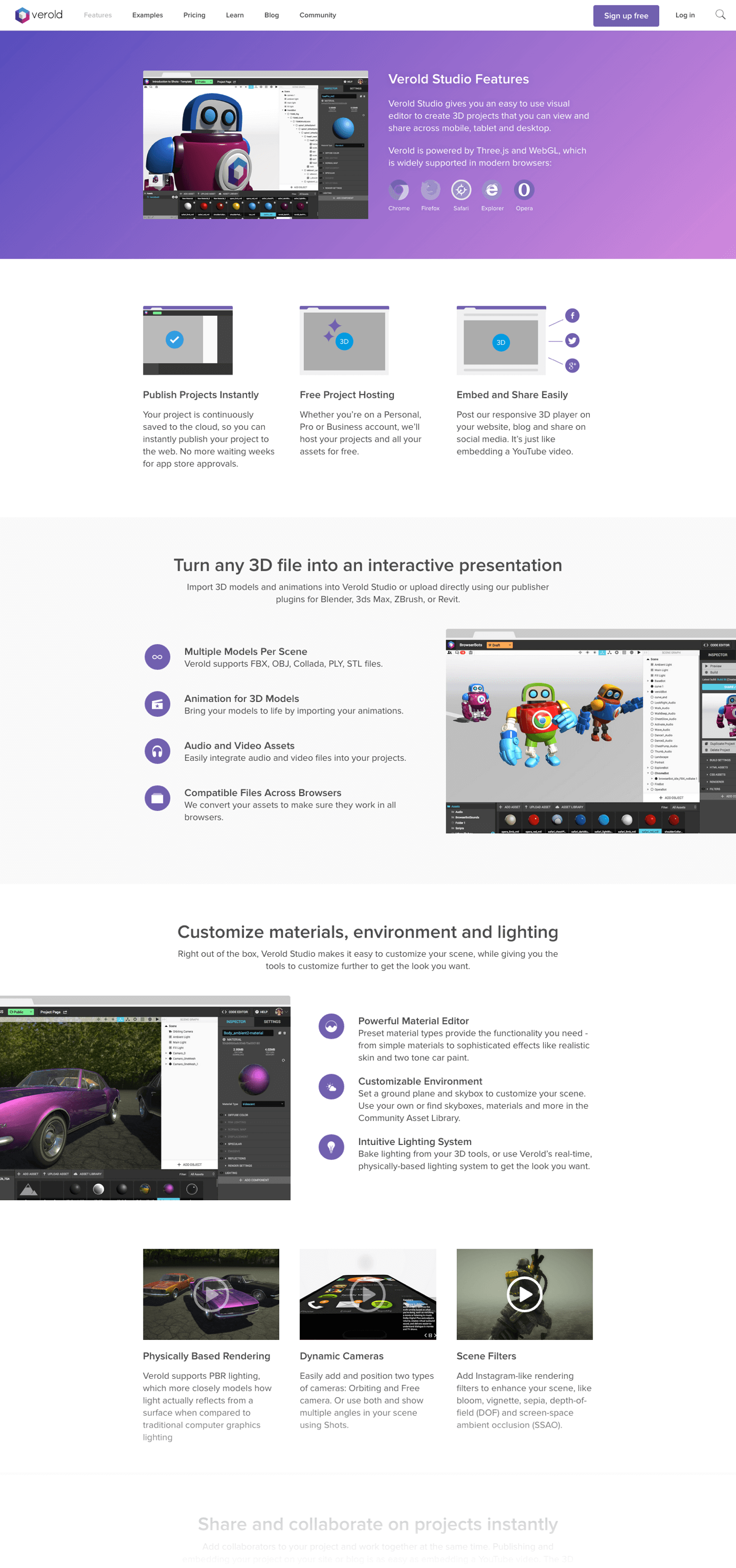
As a very visual product, many of the features of Verold Studio are better to show, rather than tell. We found projects that best showcased each individual feature and embedded those on the page.
‘What our product can do’ vs. ‘What you can do with our product’
Participants felt that the homepage didn’t clearly explain what Verold Studio actually was (‘another 3D modelling tool?’) or what value could be created with it (‘what does this do for me?’).
Participants could only find example projects on a page that listed often unfinished community projects, so their first impression of what was possible was pretty underwhelming for them.
Based on the usability studies, we decided to redesign the homepage, features and pricing pages using the new layouts and visual design. We also added an examples page to showcase the best projects, and redesigned the company page, adding our mission, team photos, press articles and a media kit.
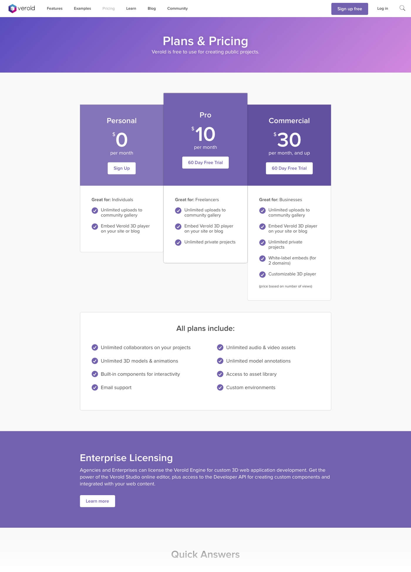
At the time of the redesign, we also introduced new pricing tiers. Our aim was to make it easier to see how the plans compared and contrasted.
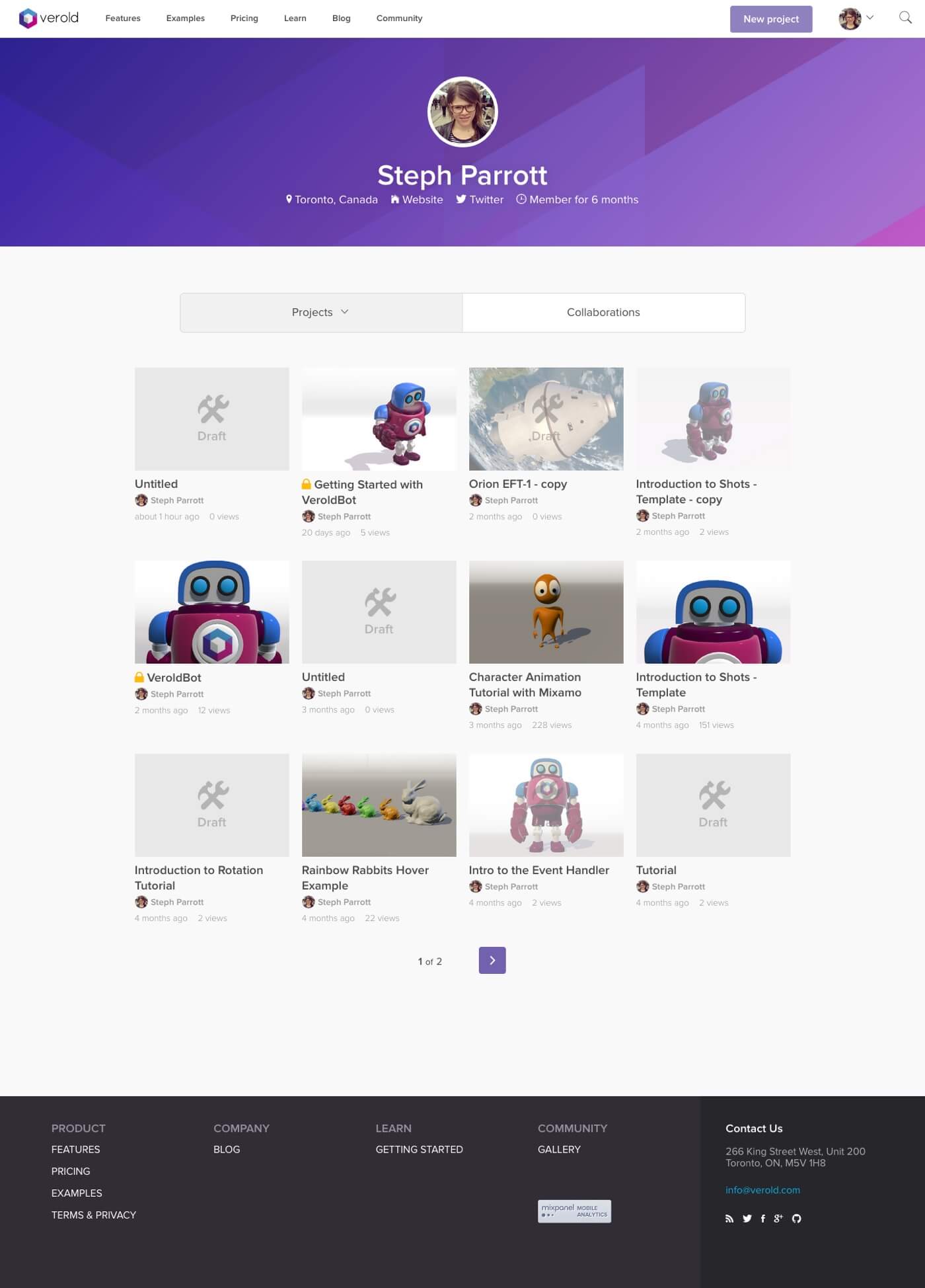
The redesigned user profile page differentiates between drafts, published and private projects.
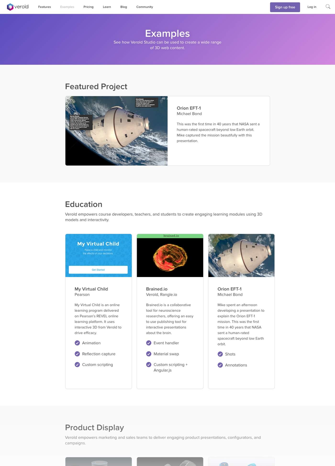
We added an Examples page to showcase the best examples of what could be made and changed the name of the Gallery to Community, to emphasize that the projects were made my community members.
User Onboarding
With the goal to improve onboarding and increase the number of projects being published, I wanted to better understand new users’ first time experience with Verold Studio. So, I sent out an email everyday for a few weeks to every new user that had signed up the day before, asking what they’d hoped to do after signing up and the number one question they had about getting started.
I was pleasantly surprised by the number of people that responded (about 30%), who took the time to write really thoughtful replies. Many even thanked me for reaching out to them.
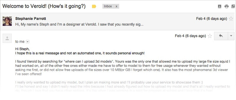
Jason Fried’s post on the subject of simple email surveys was key: send a simple, short message that sounds like a real person, even if it’s a canned message. Mentioning the importance of feedback to a small team gives the customer faith that their response will be heard and responded to. An overly designed, clearly automated message wouldn’t have been nearly as effective.
Responses ranged from finding bugs to much appreciated praise. However, one common theme that stuck out was along the lines of “I haven’t had time to try out Verold yet…” or “When I get a chance…”. Users believed that getting started was a complicated, time-consuming process because they couldn’t see a clear path to success: uploading their model and seeing it in the browser.
Our goal was to streamline the sign-up process and eliminate the number of empty projects created without a model, so that users could see the value as quickly as possible.
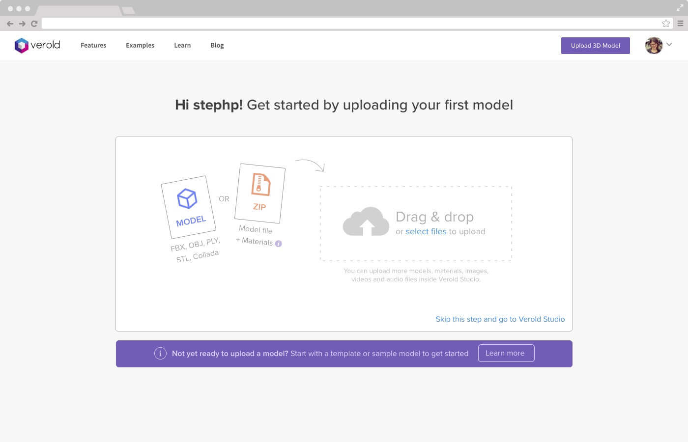
Previously, creating a new project dropped users into an empty canvas without clear next steps. This redesigned flow would require an upload first (for those without a model handy, a template or sample model would be provided).

While the model is uploading and processing, users would then be able to name their project and add other details that would appear on the project's page.
Results
As part of the redesign, we started implementing MixPanel + People Analytics in order to create a baseline for making data-driven design decisions. We didn’t get to act on that data, however, as our team got some game-changing news as we neared the end of development: Box was acquiring Verold.
As the deal was going on, the site was in limbo. We launched it in an MVP state with not quite as much polish as we would have liked, and the focus then shifted to communicating the acquisition to our users—what it would mean to their accounts, their projects and the transition plan that was being put into place. Our users were sad to see Verold Studio go, but were excited to see how the product would evolve under Box’s wing. (See how Verold has been integrated into Box).
